feat: responsive design grid (#1354)

* Responsive design grid

* Addressed PR feedback

* Bump Quartz version 4.3.1 => 4.4.0

* Moved page-header into center

* Updated docs with new layouts

* Sync updated version number with package-lock

* Table of Content scrollbar auto

* Reset node_modules

* Updated layout images

* Fixed tablet layout

* Finilazed layout images
1 files deleted
3 files added
13 files modified
| | |
|---|
| | | beforeBody: QuartzComponent[] // laid out vertically |
|---|
| | | pageBody: QuartzComponent // single component |
|---|
| | | afterBody: QuartzComponent[] // laid out vertically |
|---|
| | | left: QuartzComponent[] // vertical on desktop, horizontal on mobile |
|---|
| | | right: QuartzComponent[] // vertical on desktop, horizontal on mobile |
|---|
| | | left: QuartzComponent[] // vertical on desktop and tablet, horizontal on mobile |
|---|
| | | right: QuartzComponent[] // vertical on desktop, horizontal on tablet and mobile |
|---|
| | | footer: QuartzComponent // single component |
|---|
| | | } |
|---|
| | | ``` |
|---|
| | | |
|---|
| | | These correspond to following parts of the page: |
|---|
| | | |
|---|
| | | ![[quartz layout.png|800]] |
|---|
| | | | Layout | Preview | |
|---|
| | | | ------------------------------- | ----------------------------------- | |
|---|
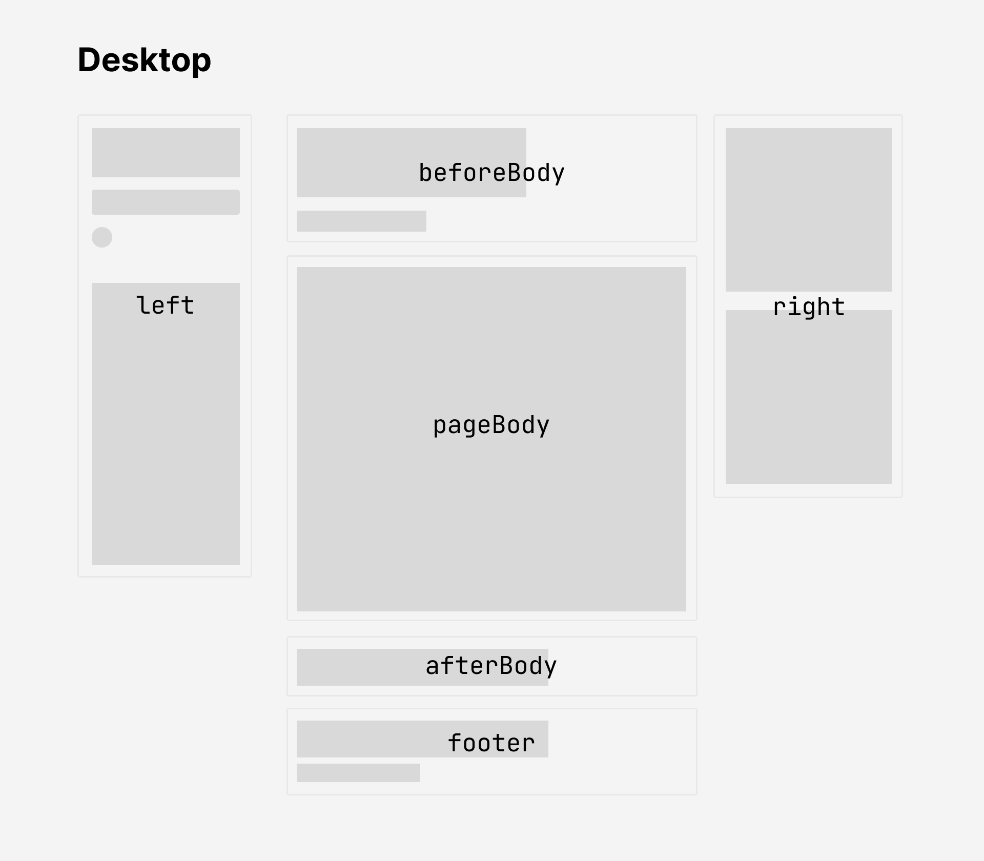
| | | | Desktop (width > 1200px) | ![[quartz-layout-desktop.png\|800]] | |
|---|
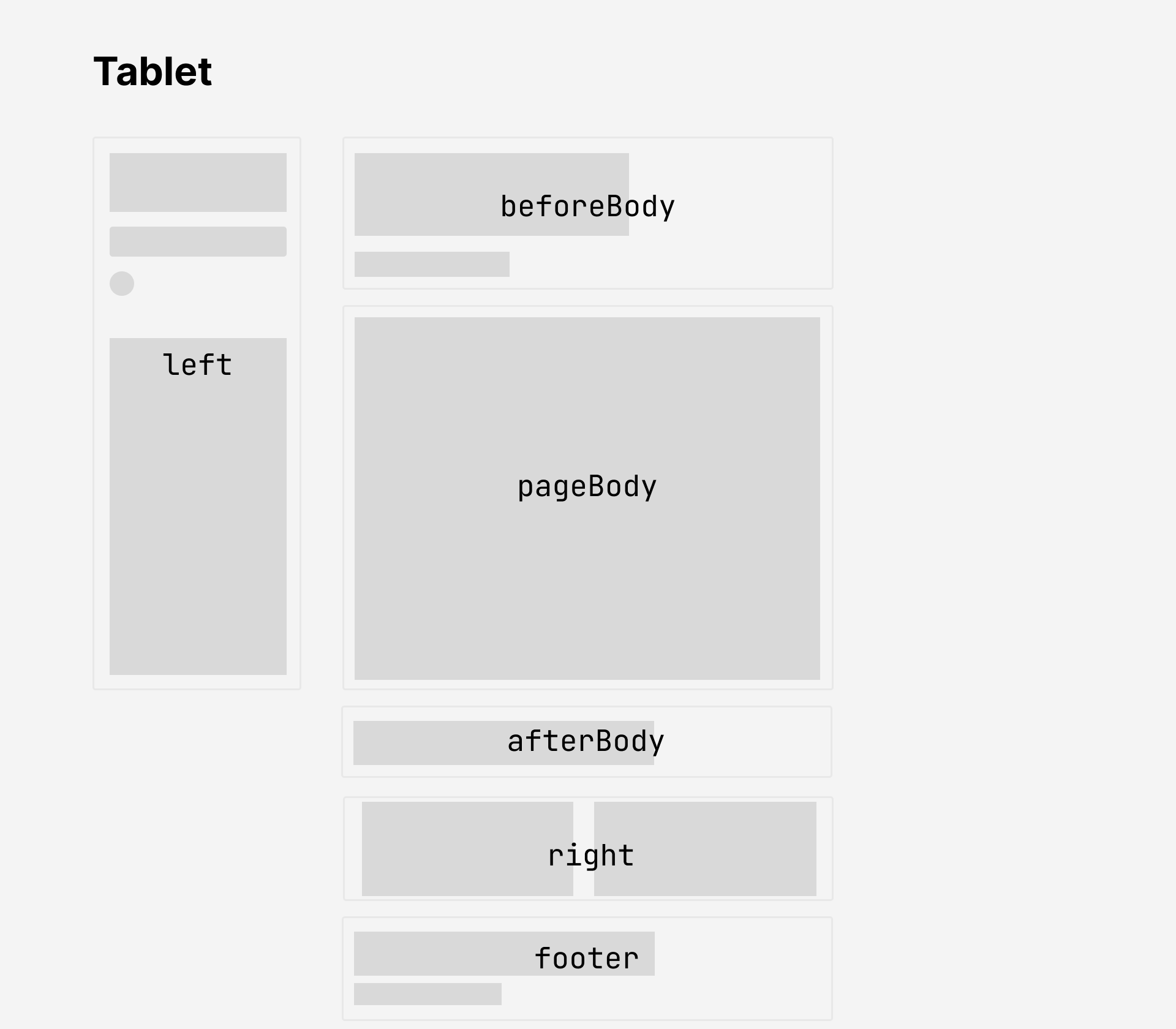
| | | | Tablet (800px < width < 1200px) | ![[quartz-layout-tablet.png\|800]] | |
|---|
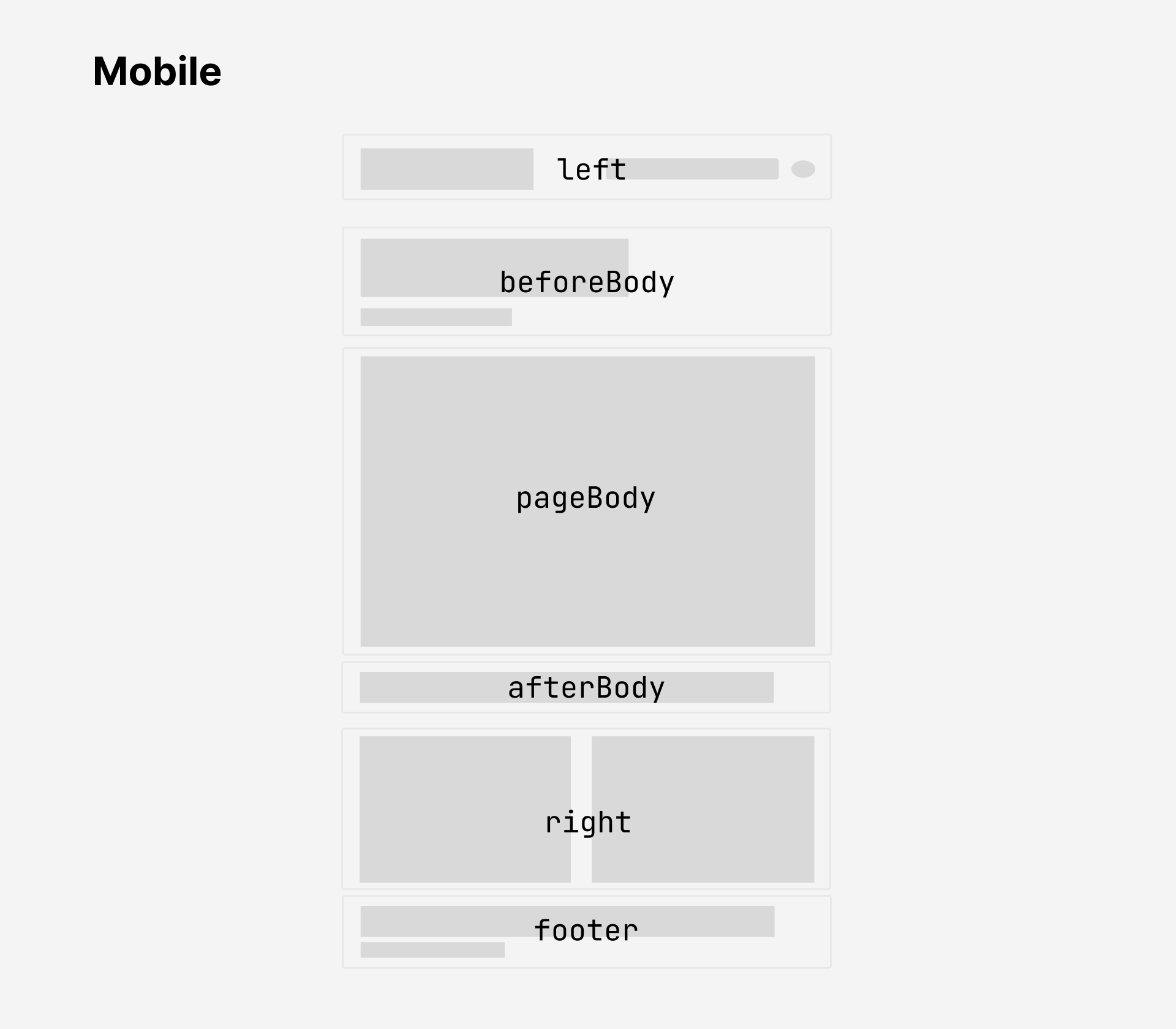
| | | | Mobile (width < 800px) | ![[quartz-layout-mobile.png\|800]] | |
|---|
| | | |
|---|
| | | > [!note] |
|---|
| | | > There are two additional layout fields that are _not_ shown in the above diagram. |
|---|
| | |
|---|
| | | |
|---|
| | | See [a list of all the components](component.md) for all available components along with their configuration options. You can also checkout the guide on [[creating components]] if you're interested in further customizing the behaviour of Quartz. |
|---|
| | | |
|---|
| | | ### Layout breakpoints |
|---|
| | | |
|---|
| | | Quartz has different layouts depending on the width the screen viewing the website. |
|---|
| | | |
|---|
| | | The breakpoints for layouts can be configured in `variables.scss`. |
|---|
| | | |
|---|
| | | - `mobile`: screen width below this size will use mobile layout. |
|---|
| | | - `desktop`: screen width above this size will use desktop layout. |
|---|
| | | - Screen width between `mobile` and `desktop` width will use the tablet layout. |
|---|
| | | |
|---|
| | | ```scss |
|---|
| | | $breakpoints: ( |
|---|
| | | mobile: 800px, |
|---|
| | | desktop: 1200px, |
|---|
| | | ); |
|---|
| | | ``` |
|---|
| | | |
|---|
| | | ### Style |
|---|
| | | |
|---|
| | | Most meaningful style changes like colour scheme and font can be done simply through the [[configuration#General Configuration|general configuration]] options. However, if you'd like to make more involved style changes, you can do this by writing your own styles. Quartz 4, like Quartz 3, uses [Sass](https://sass-lang.com/guide/) for styling. |
|---|
| | |
|---|
| | | { |
|---|
| | | "name": "@jackyzha0/quartz", |
|---|
| | | "version": "4.3.1", |
|---|
| | | "version": "4.4.0", |
|---|
| | | "lockfileVersion": 3, |
|---|
| | | "requires": true, |
|---|
| | | "packages": { |
|---|
| | | "": { |
|---|
| | | "name": "@jackyzha0/quartz", |
|---|
| | | "version": "4.3.1", |
|---|
| | | "version": "4.4.0", |
|---|
| | | "license": "MIT", |
|---|
| | | "dependencies": { |
|---|
| | | "@clack/prompts": "^0.7.0", |
|---|
| | |
|---|
| | | "name": "@jackyzha0/quartz", |
|---|
| | | "description": "🌱 publish your digital garden and notes as a website", |
|---|
| | | "private": true, |
|---|
| | | "version": "4.3.1", |
|---|
| | | "version": "4.4.0", |
|---|
| | | "type": "module", |
|---|
| | | "author": "jackyzha0 <j.zhao2k19@gmail.com>", |
|---|
| | | "license": "MIT", |
|---|
| | |
|---|
| | | </div> |
|---|
| | | </div> |
|---|
| | | {RightComponent} |
|---|
| | | <Footer {...componentData} /> |
|---|
| | | </Body> |
|---|
| | | <Footer {...componentData} /> |
|---|
| | | </div> |
|---|
| | | </body> |
|---|
| | | {pageResources.js |
|---|
| | |
|---|
| | | @use "../../styles/variables.scss" as *; |
|---|
| | | |
|---|
| | | .backlinks { |
|---|
| | | position: relative; |
|---|
| | | @media all and not ($desktop) { |
|---|
| | | overflow-y: auto; |
|---|
| | | display: initial; |
|---|
| | | &:after { |
|---|
| | | pointer-events: none; |
|---|
| | | content: ""; |
|---|
| | | width: 100%; |
|---|
| | | height: 50px; |
|---|
| | | position: absolute; |
|---|
| | | left: 0; |
|---|
| | | bottom: 0; |
|---|
| | | opacity: 1; |
|---|
| | | transition: opacity 0.3s ease; |
|---|
| | | background: linear-gradient(transparent 0px, var(--light)); |
|---|
| | | } |
|---|
| | | |
|---|
| | | & > h3 { |
|---|
| | | font-size: 1rem; |
|---|
| | | margin: 0; |
|---|
| | | } |
|---|
| | | &:has(> .overflow) { |
|---|
| | | position: unset; |
|---|
| | | } |
|---|
| | | |
|---|
| | | & > ul { |
|---|
| | | list-style: none; |
|---|
| | | padding: 0; |
|---|
| | | margin: 0.5rem 0; |
|---|
| | | & > h3 { |
|---|
| | | font-size: 1rem; |
|---|
| | | margin: 0; |
|---|
| | | } |
|---|
| | | |
|---|
| | | & > li { |
|---|
| | | & > a { |
|---|
| | | background-color: transparent; |
|---|
| | | & > ul { |
|---|
| | | list-style: none; |
|---|
| | | padding: 0; |
|---|
| | | margin: 0.5rem 0; |
|---|
| | | |
|---|
| | | & > li { |
|---|
| | | & > a { |
|---|
| | | background-color: transparent; |
|---|
| | | } |
|---|
| | | } |
|---|
| | | } |
|---|
| | | |
|---|
| | | & > .overflow { |
|---|
| | | max-height: unset; |
|---|
| | | & > li:last-of-type { |
|---|
| | | margin-bottom: 0; |
|---|
| | | } |
|---|
| | | &:after { |
|---|
| | | display: none; |
|---|
| | | } |
|---|
| | | } |
|---|
| | | } |
|---|
| | |
|---|
| | | @use "../../styles/variables.scss" as *; |
|---|
| | | |
|---|
| | | .explorer { |
|---|
| | | &.desktop-only { |
|---|
| | | overflow-y: auto; |
|---|
| | | } |
|---|
| | | &:after { |
|---|
| | | pointer-events: none; |
|---|
| | | content: ""; |
|---|
| | | width: 100%; |
|---|
| | | height: 50px; |
|---|
| | | position: absolute; |
|---|
| | | left: 0; |
|---|
| | | bottom: 0; |
|---|
| | | opacity: 1; |
|---|
| | | transition: opacity 0.3s ease; |
|---|
| | | background: linear-gradient(transparent 0px, var(--light)); |
|---|
| | | } |
|---|
| | | } |
|---|
| | | |
|---|
| | | button#explorer { |
|---|
| | | background-color: transparent; |
|---|
| | | border: none; |
|---|
| | |
|---|
| | | visibility: hidden; |
|---|
| | | } |
|---|
| | | |
|---|
| | | &.collapsed > .overflow::after { |
|---|
| | | opacity: 0; |
|---|
| | | } |
|---|
| | | |
|---|
| | | & ul { |
|---|
| | | list-style: none; |
|---|
| | | margin: 0.08rem 0; |
|---|
| | |
|---|
| | | pointer-events: all; |
|---|
| | | } |
|---|
| | | } |
|---|
| | | > #explorer-ul { |
|---|
| | | max-height: none; |
|---|
| | | } |
|---|
| | | } |
|---|
| | | |
|---|
| | | svg { |
|---|
| | |
|---|
| | | height: 80vh; |
|---|
| | | width: 80vw; |
|---|
| | | |
|---|
| | | @media all and (max-width: $fullPageWidth) { |
|---|
| | | @media all and ($desktop) { |
|---|
| | | width: 90%; |
|---|
| | | } |
|---|
| | | } |
|---|
| | |
|---|
| | | display: grid; |
|---|
| | | grid-template-columns: fit-content(8em) 3fr 1fr; |
|---|
| | | |
|---|
| | | @media all and (max-width: $mobileBreakpoint) { |
|---|
| | | @media all and ($mobile) { |
|---|
| | | & > .tags { |
|---|
| | | display: none; |
|---|
| | | } |
|---|
| | |
|---|
| | | opacity 0.3s ease, |
|---|
| | | visibility 0.3s ease; |
|---|
| | | |
|---|
| | | @media all and (max-width: $mobileBreakpoint) { |
|---|
| | | @media all and ($mobile) { |
|---|
| | | display: none !important; |
|---|
| | | } |
|---|
| | | } |
|---|
| | |
|---|
| | | .search { |
|---|
| | | min-width: fit-content; |
|---|
| | | max-width: 14rem; |
|---|
| | | flex-grow: 0.3; |
|---|
| | | @media all and ($mobile) { |
|---|
| | | flex-grow: 0.3; |
|---|
| | | } |
|---|
| | | |
|---|
| | | & > .search-button { |
|---|
| | | background-color: var(--lightgray); |
|---|
| | |
|---|
| | | margin-left: auto; |
|---|
| | | margin-right: auto; |
|---|
| | | |
|---|
| | | @media all and (max-width: $fullPageWidth) { |
|---|
| | | @media all and ($desktop) { |
|---|
| | | width: 90%; |
|---|
| | | } |
|---|
| | | |
|---|
| | |
|---|
| | | flex: 0 0 min(30%, 450px); |
|---|
| | | } |
|---|
| | | |
|---|
| | | @media all and (min-width: $tabletBreakpoint) { |
|---|
| | | @media all and not ($tablet) { |
|---|
| | | &[data-preview] { |
|---|
| | | & .result-card > p.preview { |
|---|
| | | display: none; |
|---|
| | |
|---|
| | | border-radius: 5px; |
|---|
| | | } |
|---|
| | | |
|---|
| | | @media all and (max-width: $tabletBreakpoint) { |
|---|
| | | @media all and ($tablet) { |
|---|
| | | & > #preview-container { |
|---|
| | | display: none !important; |
|---|
| | | } |
|---|
| | |
|---|
| | | .toc { |
|---|
| | | overflow-y: auto; |
|---|
| | | } |
|---|
| | | |
|---|
| | | button#toc { |
|---|
| | | background-color: transparent; |
|---|
| | | border: none; |
|---|
| | |
|---|
| | | body, |
|---|
| | | section { |
|---|
| | | margin: 0; |
|---|
| | | max-width: 100%; |
|---|
| | | box-sizing: border-box; |
|---|
| | | background-color: var(--light); |
|---|
| | | font-family: var(--bodyFont); |
|---|
| | |
|---|
| | | |
|---|
| | | .desktop-only { |
|---|
| | | display: initial; |
|---|
| | | @media all and (max-width: $fullPageWidth) { |
|---|
| | | @media all and ($mobile) { |
|---|
| | | display: none; |
|---|
| | | } |
|---|
| | | } |
|---|
| | | |
|---|
| | | .mobile-only { |
|---|
| | | display: none; |
|---|
| | | @media all and (max-width: $fullPageWidth) { |
|---|
| | | @media all and ($mobile) { |
|---|
| | | display: initial; |
|---|
| | | } |
|---|
| | | } |
|---|
| | | |
|---|
| | | .page { |
|---|
| | | @media all and (max-width: $fullPageWidth) { |
|---|
| | | margin: 0 auto; |
|---|
| | | padding: 0 1rem; |
|---|
| | | max-width: $pageWidth; |
|---|
| | | } |
|---|
| | | |
|---|
| | | max-width: calc(#{map-get($breakpoints, desktop)} + 300px); |
|---|
| | | margin: 0 auto; |
|---|
| | | & article { |
|---|
| | | & > h1 { |
|---|
| | | font-size: 2rem; |
|---|
| | |
|---|
| | | } |
|---|
| | | |
|---|
| | | & > #quartz-body { |
|---|
| | | width: 100%; |
|---|
| | | display: flex; |
|---|
| | | @media all and (max-width: $fullPageWidth) { |
|---|
| | | flex-direction: column; |
|---|
| | | display: grid; |
|---|
| | | grid-template-columns: #{map-get($desktopGrid, templateColumns)}; |
|---|
| | | grid-template-rows: #{map-get($desktopGrid, templateRows)}; |
|---|
| | | column-gap: #{map-get($desktopGrid, columnGap)}; |
|---|
| | | row-gap: #{map-get($desktopGrid, rowGap)}; |
|---|
| | | grid-template-areas: #{map-get($desktopGrid, templateAreas)}; |
|---|
| | | @media all and ($desktop) { |
|---|
| | | grid-template-columns: #{map-get($tabletGrid, templateColumns)}; |
|---|
| | | grid-template-rows: #{map-get($tabletGrid, templateRows)}; |
|---|
| | | column-gap: #{map-get($tabletGrid, columnGap)}; |
|---|
| | | row-gap: #{map-get($tabletGrid, rowGap)}; |
|---|
| | | grid-template-areas: #{map-get($tabletGrid, templateAreas)}; |
|---|
| | | } |
|---|
| | | @media all and ($mobile) { |
|---|
| | | grid-template-columns: #{map-get($mobileGrid, templateColumns)}; |
|---|
| | | grid-template-rows: #{map-get($mobileGrid, templateRows)}; |
|---|
| | | column-gap: #{map-get($mobileGrid, columnGap)}; |
|---|
| | | row-gap: #{map-get($mobileGrid, rowGap)}; |
|---|
| | | grid-template-areas: #{map-get($mobileGrid, templateAreas)}; |
|---|
| | | } |
|---|
| | | |
|---|
| | | @media all and ($desktop) { |
|---|
| | | padding: 0 1rem; |
|---|
| | | } |
|---|
| | | @media all and ($mobile) { |
|---|
| | | margin: 0 auto; |
|---|
| | | } |
|---|
| | | |
|---|
| | | & .sidebar { |
|---|
| | | flex: 1; |
|---|
| | | display: flex; |
|---|
| | | flex-direction: column; |
|---|
| | | gap: 2rem; |
|---|
| | | top: 0; |
|---|
| | | width: $sidePanelWidth; |
|---|
| | | margin-top: $topSpacing; |
|---|
| | | box-sizing: border-box; |
|---|
| | | padding: 0 4rem; |
|---|
| | | position: fixed; |
|---|
| | | @media all and (max-width: $fullPageWidth) { |
|---|
| | | position: initial; |
|---|
| | | flex-direction: row; |
|---|
| | | padding: 0; |
|---|
| | | width: initial; |
|---|
| | | margin-top: 2rem; |
|---|
| | | } |
|---|
| | | padding: $topSpacing 2rem 2rem 2rem; |
|---|
| | | display: flex; |
|---|
| | | height: 100vh; |
|---|
| | | position: sticky; |
|---|
| | | } |
|---|
| | | |
|---|
| | | & .sidebar.left { |
|---|
| | | z-index: 1; |
|---|
| | | left: calc(calc(100vw - $pageWidth) / 2 - $sidePanelWidth); |
|---|
| | | @media all and (max-width: $fullPageWidth) { |
|---|
| | | grid-area: sidebar-left; |
|---|
| | | flex-direction: column; |
|---|
| | | @media all and ($mobile) { |
|---|
| | | gap: 0; |
|---|
| | | align-items: center; |
|---|
| | | position: initial; |
|---|
| | | display: flex; |
|---|
| | | height: unset; |
|---|
| | | flex-direction: row; |
|---|
| | | padding: 0; |
|---|
| | | padding-top: 2rem; |
|---|
| | | } |
|---|
| | | } |
|---|
| | | |
|---|
| | | & .sidebar.right { |
|---|
| | | right: calc(calc(100vw - $pageWidth) / 2 - $sidePanelWidth); |
|---|
| | | flex-wrap: wrap; |
|---|
| | | & > * { |
|---|
| | | @media all and (max-width: $fullPageWidth) { |
|---|
| | | grid-area: sidebar-right; |
|---|
| | | margin-right: 0; |
|---|
| | | flex-direction: column; |
|---|
| | | @media all and ($mobile) { |
|---|
| | | margin-left: inherit; |
|---|
| | | margin-right: inherit; |
|---|
| | | } |
|---|
| | | @media all and ($desktop) { |
|---|
| | | position: initial; |
|---|
| | | height: unset; |
|---|
| | | width: 100%; |
|---|
| | | flex-direction: row; |
|---|
| | | padding: 0; |
|---|
| | | & > * { |
|---|
| | | flex: 1; |
|---|
| | | min-width: 140px; |
|---|
| | | } |
|---|
| | | & > .toc { |
|---|
| | | display: none; |
|---|
| | | } |
|---|
| | | } |
|---|
| | | } |
|---|
| | | } |
|---|
| | | |
|---|
| | | & .page-header, |
|---|
| | | & .page-footer { |
|---|
| | | width: $pageWidth; |
|---|
| | | margin-top: 1rem; |
|---|
| | | |
|---|
| | | @media all and (max-width: $fullPageWidth) { |
|---|
| | | width: initial; |
|---|
| | | & .page-header, |
|---|
| | | & .page-footer { |
|---|
| | | margin-top: 1rem; |
|---|
| | | } |
|---|
| | | } |
|---|
| | | |
|---|
| | | & .page-header { |
|---|
| | | margin: $topSpacing auto 0 auto; |
|---|
| | | @media all and (max-width: $fullPageWidth) { |
|---|
| | | margin-top: 2rem; |
|---|
| | | & .page-header { |
|---|
| | | grid-area: page-header; |
|---|
| | | margin: $topSpacing 0 0 0; |
|---|
| | | @media all and ($mobile) { |
|---|
| | | margin-top: 0; |
|---|
| | | padding: 0; |
|---|
| | | } |
|---|
| | | } |
|---|
| | | } |
|---|
| | | |
|---|
| | | & .center, |
|---|
| | | & footer { |
|---|
| | | margin-left: auto; |
|---|
| | | margin-right: auto; |
|---|
| | | width: $pageWidth; |
|---|
| | | @media all and (max-width: $fullPageWidth) { |
|---|
| | | width: initial; |
|---|
| | | & .center > article { |
|---|
| | | grid-area: page-center; |
|---|
| | | } |
|---|
| | | |
|---|
| | | & .page-footer { |
|---|
| | | grid-area: page-footer; |
|---|
| | | } |
|---|
| | | |
|---|
| | | & .center, |
|---|
| | | & footer { |
|---|
| | | margin-left: auto; |
|---|
| | | margin-right: auto; |
|---|
| | | @media all and ($desktop) { |
|---|
| | | margin-right: 0; |
|---|
| | | } |
|---|
| | | @media all and ($mobile) { |
|---|
| | | margin-left: 0; |
|---|
| | | } |
|---|
| | | } |
|---|
| | | & footer { |
|---|
| | | margin-left: 0; |
|---|
| | | margin-right: 0; |
|---|
| | | } |
|---|
| | | } |
|---|
| | | } |
|---|
| | |
|---|
| | | $pageWidth: 750px; |
|---|
| | | $mobileBreakpoint: 600px; |
|---|
| | | $tabletBreakpoint: 1000px; |
|---|
| | | $sidePanelWidth: 380px; |
|---|
| | | /** |
|---|
| | | * Layout breakpoints |
|---|
| | | * $mobile: screen width below this value will use mobile styles |
|---|
| | | * $desktop: screen width above this value will use desktop styles |
|---|
| | | * Screen width between $mobile and $desktop width will use the tablet layout. |
|---|
| | | * assuming mobile < desktop |
|---|
| | | */ |
|---|
| | | $breakpoints: ( |
|---|
| | | mobile: 800px, |
|---|
| | | desktop: 1200px, |
|---|
| | | ); |
|---|
| | | |
|---|
| | | $mobile: "(max-width: #{map-get($breakpoints, mobile)})"; |
|---|
| | | $tablet: "(min-width: #{map-get($breakpoints, mobile)}) and (max-width: #{map-get($breakpoints, desktop)})"; |
|---|
| | | $desktop: "(max-width: #{map-get($breakpoints, desktop)})"; |
|---|
| | | |
|---|
| | | $pageWidth: #{map-get($breakpoints, mobile)}; |
|---|
| | | $sidePanelWidth: 320px; //380px; |
|---|
| | | $topSpacing: 6rem; |
|---|
| | | $fullPageWidth: $pageWidth + 2 * $sidePanelWidth; |
|---|
| | | $boldWeight: 700; |
|---|
| | | $semiBoldWeight: 600; |
|---|
| | | $normalWeight: 400; |
|---|
| | | |
|---|
| | | $mobileGrid: ( |
|---|
| | | templateRows: "auto auto auto auto auto", |
|---|
| | | templateColumns: "auto", |
|---|
| | | rowGap: "5px", |
|---|
| | | columnGap: "5px", |
|---|
| | | templateAreas: |
|---|
| | | '"sidebar-left"\ |
|---|
| | | "page-header"\ |
|---|
| | | "page-center"\ |
|---|
| | | "sidebar-right"\ |
|---|
| | | "page-footer"', |
|---|
| | | ); |
|---|
| | | $tabletGrid: ( |
|---|
| | | templateRows: "auto auto auto auto", |
|---|
| | | templateColumns: "#{$sidePanelWidth} auto", |
|---|
| | | rowGap: "5px", |
|---|
| | | columnGap: "5px", |
|---|
| | | templateAreas: |
|---|
| | | '"sidebar-left page-header"\ |
|---|
| | | "sidebar-left page-center"\ |
|---|
| | | "sidebar-left sidebar-right"\ |
|---|
| | | "sidebar-left page-footer"', |
|---|
| | | ); |
|---|
| | | $desktopGrid: ( |
|---|
| | | templateRows: "auto auto auto", |
|---|
| | | templateColumns: "#{$sidePanelWidth} auto #{$sidePanelWidth}", |
|---|
| | | rowGap: "5px", |
|---|
| | | columnGap: "5px", |
|---|
| | | templateAreas: |
|---|
| | | '"sidebar-left page-header sidebar-right"\ |
|---|
| | | "sidebar-left page-center sidebar-right"\ |
|---|
| | | "sidebar-left page-footer sidebar-right"', |
|---|
| | | ); |
|---|

